
Released at the beginning of September, the decision to ditch the antique Compact Disc and focus the icon on the music note, has caused quite an uproar. The new version of the icon seems to be following the standard “more is more” approach of on screen design. It has it all: drop shadows, glows, bevels, even gradients?
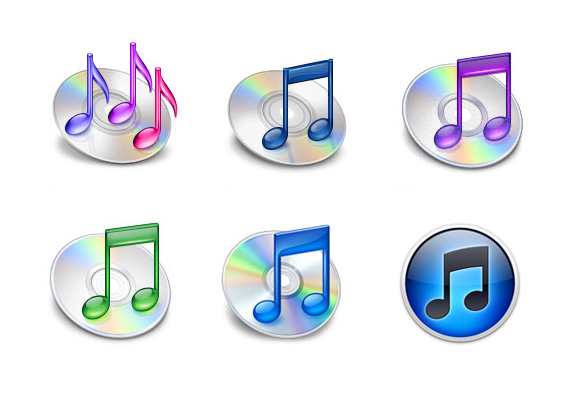
Looking back on the previous five iTunes icons, one would have to admit, the latest is definitely the best so far, however, that isn’t exactly a compliment, either. One Apple enthusiast even decided to e-mail Steve Jobs stating how the new icon “really sucks.” In one of those rare replies to random emails, Mr Jobs simply replied "We disagree. Sent from my iPhone".
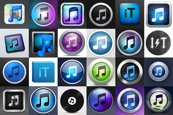
Unfortunately these efforts seem to be creating a different type of ugly. These attempts are rife with bevels, glows, shadows and 3D effects. Almost every effort kept the same music note, circular container shape and fake metallic bezel. Below is a snapshot of just some of the efforts, ranging from the incremental tweaks, to the radical revisions and the outright ridiculous.
The new icon boasts tasteless blues with the contrast pushed to max. The real mistake though, is the rendering of the music note ... it's too cartoon like. Sharpening up some of the angles, losing the curve and slimming down the crossbar and rounds, might help. But in the end, given the company it will keep in the Mac dock, is it really all that bad? Google Chrome looks like a pokemon ball, for goodness sake!
Probably the most powerful argument against the new icon, is that most of Apple’s icons are almost photo-realistic representations of things. But given iTunes' current functionality, coming up with an object to represent everything it does is almost impossible. Amongst its Apple siblings, the cartoon-like clip art feel is certainly irritating, and the result is a really cheap look. It could almost pass as a childrens music learning program, and not the world’s pre-eminent entertainment content application.

All in one package, iTunes activates, backs up and syncs your iPod, iPad and iPhone, it’s your interface for music clips, TV shows, movies, apps, games, podcasts, vodcasts, radio and ring tones, not forgetting music and also books! The name “iTunes” simply doesn’t cover all this in a convincing way. God help Apple when, and if, they choose to rename it!
What do you think?